
Sometimes – Less IS More!
Welcome to my very first Met Monday post sponsored by Susan @ Between Naps on the Porch. You can visit her blog, not only for some wonderful decorating ideas, but also to see all the bloggers who are following Met Monday. ( http://betweennapsontheporch.blogspot.com/ )
What is Met Monday? A showcase of Before and After Projects. Who doesn’t love Before and After pics?! So let’s get going…
A few posts ago, I shared one of my on-going kitchen projects – dealing with my overly large soffits above my cabinets. Most of you have already discovered that I subscribe to the “More is More” theory of decorating. Well, slap me with butter and call me a biscuit! After some trials and errors…I decided to go with the “Simple and Subdued.”
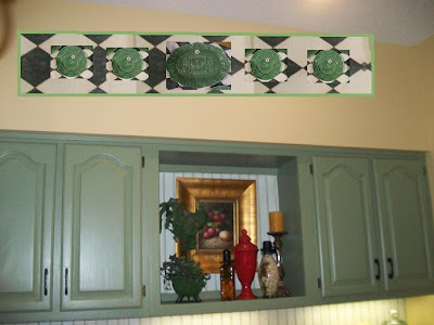
So, here’s a reminder of my BEFORE soffits…

Another BEFORE view…

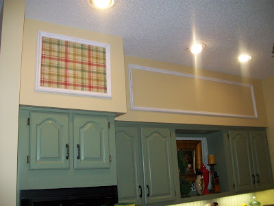
If you remember …my plan was to add some picture frame moulding and create paneling squares, fill in with wallpaper – and hang my new Portuguese Majolica plates featuring farm animals. The black and white harlequin paper, seen below, was something I considered using.
 But, after a rough Paint Program mock-up (see below), I knew it wasn’t what I was looking for. I decided to look for another paper.
 Here’s my Handy-Dandy Carpenter working his magic….
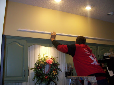
He does good work, huh? I love how he even added moulding to the tiny area on the side.
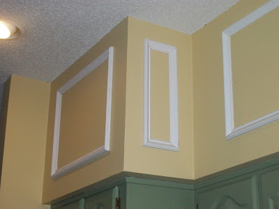
Here is the finished moulding project pre-wallpaper. I had debated about painting the moulding the same green as the cabs,
but I kinda liked the crisp white. The trim in my breakfast area is white, so I got to thinking….hmmmmm

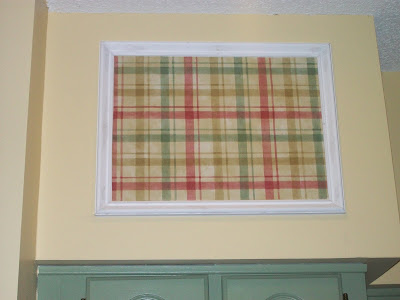
I visited my local wallpaper store, and found this awesome plaid which incorporated all the colors. I don’t think I could have found a more perfect paper. I decided to cut a small piece and
experiment with one area. Remember when I said I let my house “talk to me?”
But, after a rough Paint Program mock-up (see below), I knew it wasn’t what I was looking for. I decided to look for another paper.Here’s my Handy-Dandy Carpenter working his magic….He does good work, huh? I love how he even added moulding to the tiny area on the side.

Here is the finished moulding project pre-wallpaper. I had debated about painting the moulding the same green as the cabs,
but I kinda liked the crisp white. The trim in my breakfast area is white, so I got to thinking….hmmmmm

I visited my local wallpaper store, and found this awesome plaid which incorporated all the colors. I don’t think I could have found a more perfect paper. I decided to cut a small piece and
experiment with one area. Remember when I said I let my house “talk to me?”
Well….seeing it in the pic below, you would think I went head over heels and flipped out like I had hit a decorating gold mine. Right?
 So I digress….sometimes….LESS is MORE!

Happy Discovering a New Facet of Simple Design….Barb
Wrong! It just didn’t feel right. I felt it was going to be too “top heavy.” The object of this project was to help disguise the size of the soffit. I was concerned the wallpapered squares would actually draw the eye away from the rest of the space.
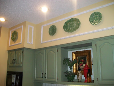
So, in the end….
I kept it simple! I know, all my Charles Faudre fans are covering their eyes and ears! Simple? What’s that? LOL
I added my plates, and heard my house breath a sigh of relief. Here’s the AFTER…
So I digress….sometimes….LESS is MORE!Happy Discovering a New Facet of Simple Design….Barb


This is perfect!
View CommentMelanie@Bella~Mella
Barb, I love the molding and the plates are just perfect. In this case less is more. This just looks so wonderful, and the soffit doesn’t near as large as before. You did find the perfect solution. Hugs, Marty
View CommentI was loving the wallpaper. But I think you are right, simple is better. Love the molding, can’t believe the difference it made.
Wendy
View CommentYEAH! Barb this is EXACTLY how I pictured the end result!
View CommentIt’s beautiful, crisp and classic.
Love it! Great job! 🙂
Barb, this looks great. The Wallpaper was a pretty paper but I agree with your assessment…I think it would have drawn the eye up and away from your beautiful cabinets. I love the molding there and the plates look fantastic! Thanks for showing us your transformation this Met Monday. Mr. Linky told me how to add some additional code in to fix the column problem so you are showing on the list now. Yipee!
View CommentLove it!
View CommentHi Barb, You know me I am a less is more and Big is better gir.Hey that almost sounded like someone from Texas.Love the moulding, Love the plates.We used the same moulding,I have it in my entry wainscotting and one panel on the end of my kitchen cupboards. I knew you would find just the right look.I am glad you listened to your lovely home.Thanks for sharing.kathysue
View CommentI never would’ve even thought of that…of course, now that I see it, it looks like it was there all along. BEAUTIFUL!
View CommentJust wonderful!!
Jan
View CommentBeautiful! exactly the right choice! The plaid was pretty…maybe as fabric somewhere???
View CommentGreat job!
That turned out great!
View CommentLooks great just the right addition;) Thanks for your wonderful comments on my makeover;) French
View CommentI really like it, and think you did the right thing by not using wallpaper.
View CommentGlenda
I thought that the plaid looked really nice, but you’re right, less is more in this case. It looks just perfect. Great job, hugs, Kathy
View CommentWow! Looks great, Barb! Could CF be wrong occasionally??? Did I say that? Blasphemy! lol Have a great day…Debbie
View CommentLove it and in this case the house was right, the plain with plates is better. Bravo to the carpenter on the molding, even the small wall too.
View CommentI like it!
Linda
Barb,
View CommentLove what you did! Perfect! I love to use picture frame molding to add texture, interest and a design element. I am in the process of adding these to me bedroom. I’ll share pics when its all done. Thanks for sharing!
It’s really pretty!
View CommentIt’s beautiful!! I just LOVE molding panels like that. I’ve never seen them used above the cabinets, but what a clever idea. I’ve been wanting my husband to put them in my dining and living room. Maybe one of these day. I’m a new blogger and would love you to stop by and visit sometime.
View Comment~Elizabeth at Grand Occasions
So glad i came here!!!
View CommentWhy?
because i loved it!
great choice!! 🙂
And applause to the “carpenter”!
Wonderful solution for your soffits! Great transformation!
View CommentLove it! It really looks great simplified!
View CommentGorgeous, Barb! Fabulous and perfect. I’m loving this look.
View CommentI have often found simple solutions to be the best, no matter what the problem. I feel, as your house does, that you made the right choice.
View CommentBEAUTIFUL ~~~ great, creative and yes, you made the “RIGHT” decision~~~ This comes out so fresh n’ clean~ just wonderful, Barb!!! Best, Linda
View CommentBeautiful platters and a great kitchen make over!!! I think you were right about not using the wallpaper.
View CommentGod bless your wonderful family keeping us free! Your neighbor in Goldsboro, Jewel 😀
Your final choice was PERFECT!
View CommentBeautiful!
View CommentJust found you.
Love what you ended up choosing. In this case, simple was really much better!
Blessings, and I’ll be back to see more.
Barbara Jean
View CommentAhhhh, beautiful! Your house was right! ♥ Diane
View CommentHi Barb… dropping by from Debbie’s blog… I love your kitchen redo… the Majolica is beautiful against the pretty pale yellow wall… and you’re right, less is more… except I somtimes have a problem when I’m crossing from less to too much! LOL…
Hope you’ll drop by my blog, French Lique, and visit. Blessings, Dixie
View CommentIt turned out beautifully, Barb. Your plates are gorgeous, love the color!…Christine
View CommentBarb, Perfect solution! It looks amazing! Don’t you just love it when a plan comes together! 🙂 ~Rhonda
View CommentHow pretty! We are doing a lipstick remodel on our kitchen…can’t take down the soffets w/ this budget, and just don’t know what the hell to do w/ them! I love this idea!
View Comment